
In the tech world, we often get bogged down by gigabytes and megapixels. But let’s be honest: the first thing you notice when someone pulls out a new device is the finish. For 2026, Apple has decided to break its own rules. The iPhone 17 colors represent a departure from the “safe” pastels and muted grays we have seen for years.
Whether you are looking at the standard models or the ultra-thin “Air,” the color choices this year feel deliberate. They aren’t just shades; they are statements. Apple is leaning into a “two-tone” aesthetic, utilizing a new aluminum unibody design that makes the colors pop in a way titanium never could.
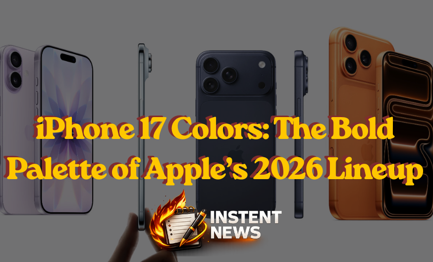
The Showstopper: iPhone 17 Colors for the Pro Models
If you are eyeing the Pro or Pro Max, prepare for a shock. For the first time in years, there is no “Space Black” or “Graphite.” Instead, Apple has gone bold. The flagship iPhone 17 colors for the Pro line include:
- Cosmic Orange: This is the headline-grabber. It’s a deep, metallic copper that shifts in the light. It feels premium, like a high-end sports car.
- Deep Blue: A moody, sophisticated navy that replaces the Natural Titanium of yesteryear. It’s professional but far from boring.
- Silver: The “Timeless Standard.” This year, it features a matte finish that is incredibly forgiving with fingerprints.
The decision to drop dark neutrals like black in favor of Cosmic Orange shows that Apple is targeting a more expressive professional. It’s a risk, but in a sea of gray slabs, these Pro colors stand out.
The Minimalist Choice: iPhone 17 Colors for the “Air”
The new “iPhone Air” (or iPhone 17 Slim) is all about being light and thin. Naturally, the iPhone 17 colors for this model reflect that “airy” philosophy. These shades are polished and mirrored, giving the phone a jewelry-like quality.
- Sky Blue: A pale, crystalline blue that looks almost white in certain lighting.
- Light Gold: This isn’t the “yellow gold” of the past. It’s a soft, champagne-metallic finish that is incredibly subtle.
- Cloud White: A cool, crisp white that pairs perfectly with the 5.6mm thin frame.
- Space Black: Interestingly, while the Pros lost their dark shade, the Air kept a deep, glossy black for those who want that classic silhouette.
Playful and Bright: The Standard iPhone 17 Colors
For the base model, Apple continues its tradition of offering a vibrant “candy shop” of options. The standard iPhone 17 colors are designed for those who don’t want to hide their phone in a case. This year, the lineup includes:
- Lavender: A soft, floral purple that has been a fan favorite in previous leaks.
- Sage: A muted, earthy green that feels very “organic.”
- Mist Blue: A more saturated version of the Air’s blue, perfect for a pop of color.
- White and Black: The classic anchors of the collection.
These colors are applied to a new aluminum frame that feels smoother and more ergonomic than the sharp edges of the iPhone 12 through 14 eras.
The Psychology of Choice: Which Shade Suits You?
Choosing from the iPhone 17 colors is more than just a visual preference; it’s about maintenance. If you are someone who hates smudges, the Silver or Cloud White options are your best friends. These lighter tones naturally camouflage skin oils and fine scratches.
On the other hand, if you want your device to be a conversation starter, Cosmic Orange is the only way to go. It’s the “signature” color of 2026. In the resale market, these signature colors often hold their value better because they are instantly recognizable as the newest model.
Design Meets Durability: The New “Ceramic Shield” Finish
It’s not just about the pigment. The iPhone 17 colors are viewed through a new “Ceramic Shield 2” back. This material has an anti-reflective coating that makes the colors look deeper and more vibrant. It also reduces glare when you’re using your phone outdoors in the Saudi sun.
Apple has also moved to a “two-tone” look for the Pro models. The aluminum frame and the Ceramic Shield back have slightly different finishes. This creates a subtle contrast that makes the Deep Blue and Cosmic Orange look multi-dimensional rather than flat.
The Evolution: How 2026 Compares to Previous Years
Looking back at the iPhone 15 and 16, the palette was very safe. We had “Desert Titanium” and “Teal.” But the iPhone 17 colors feel like a return to the bold experimentation we saw with the iPhone XR or the iPhone 5C, but with a grown-up, luxury twist.
By utilizing an aluminum unibody, Apple has been able to achieve saturations that were simply impossible with titanium. This is why the Sage and Lavender look so much richer than the washed-out colors of 2024.
Conclusion: A Color for Every Personality
The 2026 lineup proves that Apple is finally listening to users who want more personality in their tech. From the high-octane Cosmic Orange of the Pro series to the ethereal Sky Blue of the Air, the iPhone 17 colors offer something for everyone.
If you’re planning to upgrade this year, don’t just look at the specs. Think about how that color will look on your desk or in your hand. For the first time in a long time, the color of your iPhone might just be its most exciting feature.
")
")
")