
Apple just pulled off one of the biggest design pivots in its history. If you are shopping for a new flagship phone, you are in for a shock. The tech giant completely erased space gray, black, and gold from its premium lineup. Instead, we have a highly curated, three-color universe that completely redefines what a premium smartphone looks like. This design choice changes the entire look of the phone. The aluminum unibody and massive full-width camera plateau display color much more intensely than previous titanium bands. It is a massive departure from tradition. Let’s dive deep into the specific shades available for the new lineup.
The Bold Evolution of iPhone 17 Pro Colors
For years, pro-tier users expected safe, muted tones. Apple broke that unwritten rule completely. The current collection features three distinct options:
- Cosmic Orange
- Deep Blue
- Silver
By narrowing the selection down to just three options, the choice seems simpler on paper. However, the visual impact of these choices is much higher. The heat-forged aluminum frame combines with a matte glass back. This creates a striking two-tone effect on the device surfaces. The color shifts drastically depending on your ambient lighting environment.
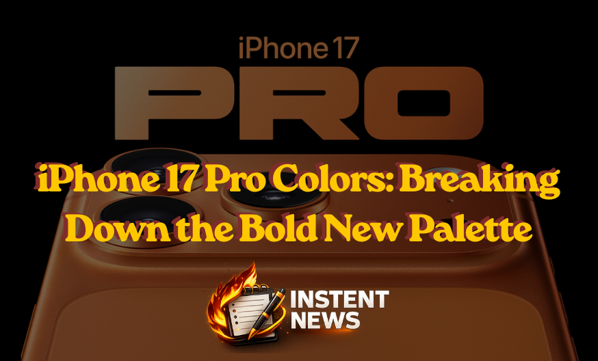
Cosmic Orange: The Standout iPhone 17 Pro Colors Star
If you want everyone to know you have the latest hardware, this is your choice. This shade is easily the most daring color Apple has launched in a decade.
In direct daylight, the back glass reflects a warm, rich amber tone. Under indoor artificial lights, it shifts into a metallic burnt orange. Because the raw aluminum beneath the anodized coating is relatively light, small scuffs on this model do not show up easily. It is an adventurous choice that appeals directly to creators and design enthusiasts who are tired of boring tech.
Deep Blue: The Professional Choice for iPhone 17 Pro Colors
Are you missing the traditional space gray or black finishes? This option is your closest alternative.
This tone is incredibly dark and stealthy. Indoors, it looks almost entirely black. It only reveals its true oceanic depth when caught directly in the light. It offers a sleek, professional aesthetic that fits perfectly into any corporate boardroom.
A Quick Warning on Wear: Because the dark anodized finish contrasts heavily with the silver aluminum underneath, deep scratches or edge chips on this model will show up much more clearly than on the other two variants.
Silver: The Most Practical iPhone 17 Pro Colors Option
The final option represents a timeless classic. It pays homage to the original roots of Apple design.
This choice features a bright, clean white-silver back paired with a polished silver frame. It is the absolute best option if you prefer using clear cases. More importantly, it is the most durable option visually. If you scratch the surface, the bare metal underneath matches the finish perfectly. The damage blends right in. It is the safest choice for maintaining a pristine look over years of daily use.
How the New Two-Tone Design Changes Everything
The color application this year is completely unique. The massive camera plateau on the back is fully exposed. This means your color choice remains highly visible even if you use a heavy-duty protective case.
When choosing your color, think about your lifestyle. If you go case-free and hate fingerprints, the matte texture on all three models will serve you well. If you are prone to dropping your device, the lighter tones will hide the battle scars much better than the darker alternatives. Apple took a massive gamble by killing off standard black, but this vibrant new direction makes the hardware feel genuinely fresh.
Selecting the Perfect Shade
|
Color Option |
Best For |
Visual Wear Resistance |
| Cosmic Orange |
Trendsetters and creatives |
Moderate |
|
Deep Blue |
Traditionalists wanting a dark look |
Low (scratches show easily) |
|
Silver |
Minimalists and case-free users | High (best at hiding scuffs) |
If you want to see these finishes under different lighting conditions before buying, watching an in-depth video breakdown is highly recommended. You can check out this iPhone 17 Pro Colors In-Depth Comparison to see exactly how the Cosmic Orange, Deep Blue, and Silver models look in real life. This video is incredibly helpful because it provides a side-by-side view of the real hardware, showing how the light hits the new metallic finishes and how they look inside cases.
")
")
")